Movie Poster: Design Principles
When looking at design principles (space, proximity, colour choices, hierarchy, cohesion, focal points, etc.), we looked at several movie posters for examples.
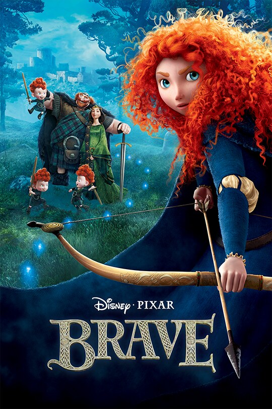
(Brave by Disney, https://lumiere-a.akamaihd.net/v1/images/p_brave_20488_9e833e2b.jpeg)
I think this "Brave" movie poster has some good elements. I like how (in the layout) the designer has used space and the positioning of the main character to sort of frame the elements in the background. The designer has also used lots of cool blue and green tones in the background to make the red colour(and the main character) stand out. This was probably done since the red hair is a prominent feature of the character and reflects her personality. I think the personalities of the other characters are also portrayed, but through their poses. The mother has quite a regal pose(and is wearing an emerald sort of green), the kids are playing with swords (which could be mimicking the father) which shows their playful personalities, and the father has quite a proud pose in the way that he is holding the sword and looking at his children.
Also, how the wisps in the background move around the sword is quite interesting. Since rather than being in a straight line, they curve to accommodate the family and go past them into the distance (towards the ruins in the far background), I think this could be to guide the viewers eyes to the other elements of the poster. This also links to the storyline of the film, since the main character follows the wisps in the story and in the poster, they kind of start where she is standing. This placement along with the poses of the characters, creates a sense of movement in the poster.
The placement of the text is also good. The designer has used the cloak as the background for it, so that it doesn't get lost in the detailed background. They have also used a sort of Celtic font, which links to how the story is set in Scotland. I also think the curly patterns (within the font) pair nicely with the main characters hair, as well as smaller details like the pattern on the bow, the mother's hair (the braid) and the chainmail on the father's outfit. The text also is quite minimal, including only important information (Brave, Disney and Pixar). With the title "Brave" being the biggest, since it is most important information.


Comments
Post a Comment