User Experience and Web Design
Today we did a user experience test, by looking at three coffee shop websites and seeing how accessable they are.
The sites we looked at:
 |
| Coffee Island Coffee Shop | Coffee-Tea & Home Barista e-shop |
 |
| Homepage | Starbucks |
These are some questions we looked at after:
➊ Could the sites do anything better to present the actual interior atmosphere of their shop?I think all three of the websites could do a better job at presenting their interior atmosphere, since there were very few images showing this. I couldn't really get too much of an idea of what the coffee shop might be like inside, except from mabye the sort of vibe they might be going for based of the website. I think this could be improved by showing more interior images and maybe an image showing the layout layout or a virtual tour.
➋ Were there any other qualities about the different sites that this activity didn't take into account?
I don't think any of the websites had any search options, but the coffee island and starbucks websites do have different subsections in them to help with finding things in the shops. These sorts of things might be important to help people find what they are looking for.
Other than that maybe we could have highlighted the similarities of the pages like how they all had quite similar homepage layouts (A main banner followed by some of the subsections of the website/what they offer and at the very bottom contact information/social medis).
➌ If you were asked to work with a team to build a new coffee shop's website - which example would you be more influenced by?
➌ If you were asked to work with a team to build a new coffee shop's website - which example would you be more influenced by?
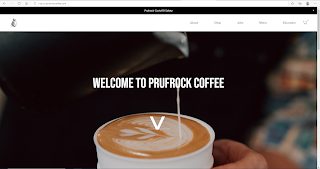
I think I would probably be more influenced by the coffee island shop in terms of the sites layout, but I think including some images like those in the prufrock website would be interesting since I think some of the images they use are quite dynamic.
➍ If you were making a site for a different purpose, what sort of 'scenario' would you create to test examples?
➍ If you were making a site for a different purpose, what sort of 'scenario' would you create to test examples?
The scenario would depend on the purpose of the site that is being tested. For example a website used for sharing information, might have a scenario where you need to find a certain piece of information or maybe a certain article and maybe how easy it is to know the reliability of the information.
5 tips for Web design:
(From this website: 10 Usability Heuristics for User Interface Design (nngroup.com))
- Consistency: Keeping words/ actions consistant so that the user doesn't have to question them. Eg. On my portfolio I used the same style/colour buttons for the links to my blog posts, throughout the pages.
- Minimalistic design: Giving the user only relevant information and allowing them to focus on the essentials.
-User control and freedom: Giving the user a way to get back if they accidentally click something.
-Using language that the user will understand: Avoiding jargon and instead using words the user would probably be familiar with.
-Visability of system status: Making sure the user knows where they are on the site, for example using a header.


Comments
Post a Comment