Animate: PosterLayouts

Today we started off by looking at some poster layouts and then we had a go at making our own version of a Science Museum poster for a 'Hidden Heros' exhibition. We were given the assets which were used in the original poster.
To start we added all the assets to the stage and then we could rearrange them however we wanted.
I came up with the idea of adding a spotlight to make the paper clip the focus point. I added a circle and then drew out from the circle. I changed the stage colour to a dark blue and experimented with different blending options and tints with the text. I added another paperclip at the top to 'hold up' some text. I also added paper clips to the logo.
After this I went on to animate the spot light to move, however I wanted the paperclip to not be visable when the spotlight is not on it (to tie into the hidden heros title). To do this I duplicated the spotlight layer (later converted the spotlight into a symbol so I could motion tween it) I then used the pen tool to add a shape around the spotlight circle and filled it with the background colour. I then removed the outlines from this layer as well as the spotlight fills and I was left with a blue shape around the spotlight circle which you can't see. I then moved this layer above the paperclip layer and selected this layer when animating the spotlight so that they moved together. I think this animation could maybe be better but I think it does what I intended it to.
 |
| Screenshot before I animated it. |
 |
| The actual ScienceMuseum poster. hidden heros | Graphic design fun, Poster design inspiration, Creative graphic design (pinterest.co.uk) Hidden Heroes - Science Museum Blog |
 |
| Another version of my poster where I swaped around the text on the right at the top and bottom. Since I realised that it might be better to have the booking information next to the logo and socials. '100 Things Every Designer Needs to Know About People' - Susan M. Weinschenk Ph.D Takeaways: -Peripheral Vision: Don't put flashing/blinking images in the peripheral of a page that you want people to read. Try to incorporate the peripheral into the design, since people will use both central and peripheral vision when looking at things. -People Identify Objects by Recognizing Patterns: Try to incorporate patterns, since people will look for them. Use simple shapes for things that you want people to recognise (Geons). -There’s a Special Part of the Brain for Processing Simple Visual Features: Less is more when you want to grab visual attention. If you have one item on a page a different colour it will stand out. -People Scan Screens Based on Past Experience and Expectations: Put important information 30% away from the top of the screen and 30% away fro mthe left/right margin. Avoid putting 'Task' information in the peripheral, instead use this space for things like logos, navigation menus, branding or images, to give the gist of what the person is looking at. Make sure the page is easy to read, instead of making people look back and forth between parts of the page. - People Remember Only Four Items at Once: Limit choices or items to 3 or 4. If you can't limit them group them together in 3-4 chunks of 3-4 items. Make sure that there is no more than 4 items in each chunk. Try not to overload people with information. An interesting poster we looked at:  The Jungle Book Alt Movie Poster by Olly Moss I think this poster is interesting because of the use of negative space and the mixture between the cartoon style and the smaller details. There is minimal text and a consise colour pallette. Depth is created using the colours and the shapes of the tiger stripes/trees, this also draws attention to the character and the snake. After this we had a think about how we would make our interactive posters. We had some more time to work on our posters on friday so I worked on the main page and the booking page.  My main page so far. I added some rotating sections inspired by an image I found on Google (Future Innovation And Media Concept Stock Photo - Download Image Now - iStock (istockphoto.com)).  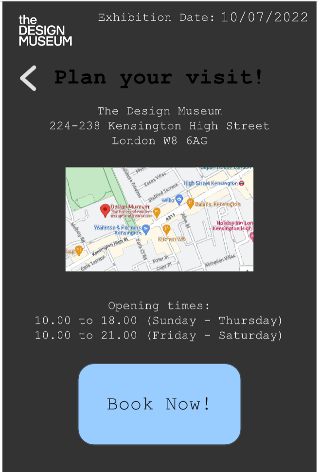 |


Comments
Post a Comment